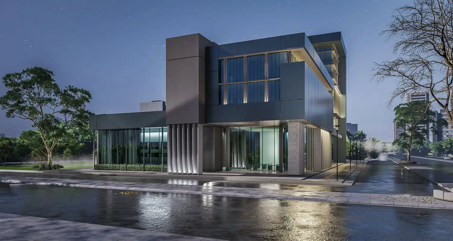
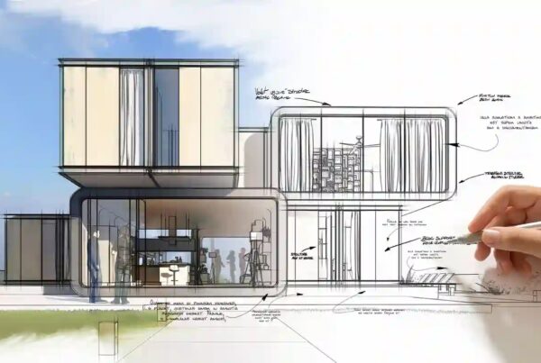
Exterior renderings have become an essential tool in the design process, playing an important role in communicating the visual representation of a project. Exterior rendering allows architects to provide a realistic visualization of their designs and enables clients to see what their building will look like before construction. However, despite the latest technology and rendering software, even the most experienced architects and designers can make mistakes in exterior rendering. This article will explore 11 common exterior rendering mistakes you should avoid. (see our works)
Poor lighting
Lighting is one of the most critical aspects of any rendering. Professional lighting can display the look and feel of your design, enhance the details, and create a more realistic and attractive rendering. Poor lighting leads to a dull and soulless exterior rendering and may not impress your customers. When creating an exterior rendering, paying attention to the type of light used, its intensity, and its location is necessary. Using natural light as a starting point and adding artificial light to highlight design features is best. Adjust the lighting to create shadows and reflections that make the rendering more realistic.
Lack of attention to detail
One of the common exterior rendering mistakes is a lack of attention to detail, which can make the rendering look incomplete and unrealistic. Paying attention to details such as texture, light, color, patterns, materials, and surroundings makes a design stand out and gives it personality. These details should be as close to reality as possible to provide clients with a clear understanding of how their building will look when completed. Clients are impressed with renderings that show better details of the design.
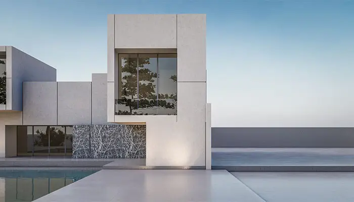
lack of attention to detail and ignoring the environment are two common exterior rendering mistakes
Ignoring the environment
The environment is another critical aspect of exterior rendering that architects often overlook. Ignoring the surroundings can create a rendering that looks out of place and unrealistic. The closer the environment is to the building’s actual location, the viewer will have a better understanding of the project. The environment can significantly affect the look and feel your rendering creates for customers. This includes the surrounding landscape, neighboring buildings, passing cars, and even the time of day. Therefore, choosing a background that complements the design and helps create a realistic representation of the building in the desired location is better.
Poor choice of camera angle
The camera angle of your render is another crucial aspect to consider. Choosing the wrong angle is one of the most common mistakes in exterior renderings that can result in an unflattering representation of your design. For example, if the camera is too close to the building, it can create a distorted image that does not accurately represent the size and scale of the structure. Conversely, design details may be lost if the camera is too far away. Therefore, consider the building’s shape, size, and location when choosing the camera angle. Choose the best angle to showcase the design’s best features. In this way, potential customers have a correct and better understanding of the building they will live in.
Excessive design complexity
Architects often make the mistake of overcomplicating the design. Another common mistake in exterior rendering is crowding the layout. However, including the details that make the design stand out is essential. Too much detail can create a cluttered and confusing rendering. If the design is too complicated, the clients will not be able to visualize the final shape of the building. So when creating an external render, aim for simplicity. Focus on the most critical aspects of the design and highlight those features.
Ignoring weather conditions
Paying attention to the weather conditions significantly affects how realistic your rendering will look. Ignoring weather conditions makes the final design look unrealistic. So, it’s best to include weather conditions that match the building’s location to make it easier for the customer to imagine the building.
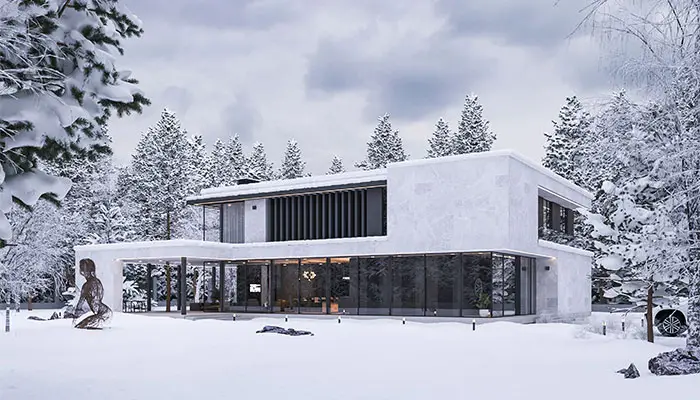
attention to the weather conditions in exterior rendering
Too much texture
Texture is an essential element in creating a realistic rendering, adding depth and complexity to exterior images. However, be careful not to overdo it as too much texture can make the rendering look messy. While the presence of textures in moderation is very important, it’s essential to choose textures that complement the building’s design and its surroundings. Also, ensure that the texture is applied evenly throughout the render.
Poor quality texture
Another common mistake in exterior rendering is using poor-quality textures. High-quality textures are essential in creating a realistic rendering, and poor-quality textures can make the rendering look pixelated and blurry, affecting the overall image quality. So, it’s crucial to choose textures that fit the design and the surrounding environment to add depth, dimension, and realism to the building.
Incorrect scale
Incorrect scaling is another mistake in most exterior renderings. Accurately scaling the building size, surroundings, people, and scenery is crucial in making the rendering realistic. Incorrect scaling can make a building appear too small or too large and affect the proportion of the surrounding landscape. So, it’s best to ensure all elements are correctly scaled and proportional to each other while creating a render.
Using Realistic Reflections
Reflections add depth to exterior renderings when created correctly. Therefore, it’s essential to use realistic reflections to enhance the final design’s attractiveness. To achieve this, paying attention to natural light, camera angles, and using appropriate reflections that match the surrounding environment is crucial.
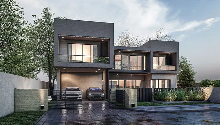
using realistic reflection in exterior rendering
Unnatural colors
Colors are essential in any exterior rendering image and should look natural and realistic. Using incorrect and unrealistic colors or colors that conflict with the design can result in an unrealistic and unattractive image. So, it’s crucial to choose colors that complement the building’s design and surroundings, and they should not conflict with the surrounding landscape.
Conclusion
Exterior renderings play a vital role in presenting a construction project’s design. It allows clients to visualize the finished product, and understand the project’s location and design before construction. However, mistakes can happen, even for the most experienced architects. Therefore, avoiding common exterior rendering mistakes is crucial to create a realistic and attractive final design for both architects and clients.
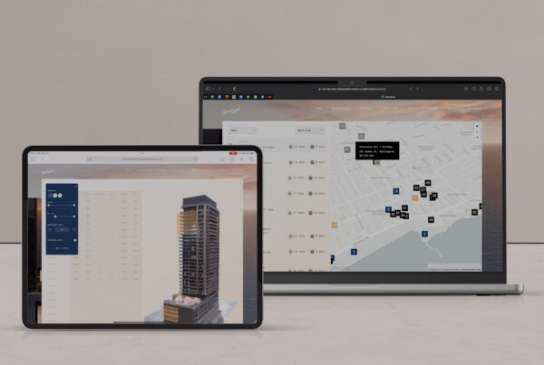
Qoo Studio allows you to showcase your development to buyers prior to construction. Our virtual tours provide buyers with visualizations of the surrounding environment, exterior and interiors of the project – for both residential and commercial projects. This is modern pre-construction marketing.
Contact us today to schedule a free consultation or inquire about an upcoming project you have! We can be reached by telephone (416-200-0988) or email. A member of our team will get back to you as soon as possible – we look forward to meeting you.


